ShopDreamUp AI ArtDreamUp
Deviation Actions


Suggested Deviants


Suggested Collections


Description
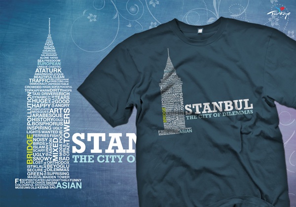
The City of Dilemmas
The City I born, the city I love..
For more information visit my website : [link]
Check my gallery.

The City I born, the city I love..
For more information visit my website : [link]
Check my gallery.
Image size
600x420px 85.16 KB
Comments9
Join the community to add your comment. Already a deviant? Log In
Not Constantinople?